KIO Case Study: Website & Automation
Flowblox: How an Automated Website Saved 12 Hours a Week
An all-in-one platform for collaboration required a home page that was intuitive, engaging, and highly effective at communicating its core value: saving time and supercharging team workflows.
Presented by HAMZA LAASRI (KOLCHI IN ONE)
Published: September 2023
The Challenge & The Goal
Flowblox, a productivity and team collaboration platform, needed a new, fully modern, and fun website design focused solely on the Home Page. Our primary goal was to create a user experience that was intuitive, engaging, and highly effective. We aimed to streamline the user journey and highlight the platform’s ability to save time and supercharge team workflows through simplicity, usability, and responsive design.
“This project was one of the easiest for us because our client needed a new, fully modern and fun website design, which is a type of project we really enjoy.”
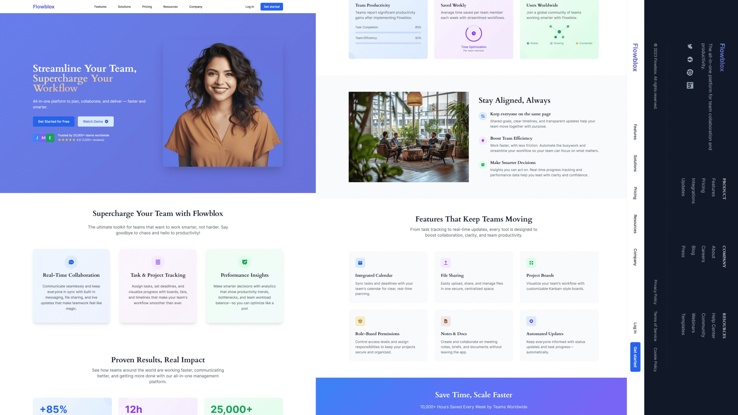
I. Capturing Attention: The Hero Section

For the hero, we prioritized user experience with a clear, engaging layout. The bold title, “Streamline Your Team, Supercharge Your Workflow,” paired with concise value text, immediately grabs attention. We provided intuitive next steps with a prominent “Get Started for Free” CTA and a “Watch Demo” link, centralizing focus and preventing user confusion. Credibility was boosted by adding a customer review snippet.
II. Establishing Value & Trust
The Core Value Proposition
The value section highlights the platform with the headline “Supercharge Your Team with Flowblox” and the tagline: “Work smarter, not harder. Ditch chaos for productivity!” We broke down the offering into three key benefit areas:
Seamless messaging, file sharing, and live updates that make teamwork flow like magic.
Assign tasks, set deadlines, and visualize progress with boards, lists, and timelines.
Analytics that show productivity trends, bottlenecks, and team workload balance for optimization.
Quantifiable Results (The Hook)
The Hook section is crucial for credibility, reinforcing the statement “Save Time, Scale Faster.” By showcasing powerful metrics, we emphasize the tangible return on investment.
Team Productivity
Saved Weekly
Users Worldwide
III. The Grand Finale: Conversion
The user journey concludes with an approachable Contact Section and a clean footer. We styled the contact form to be inviting and reassuring, using the headline “Let’s Start a Conversation!” and promising quick, relevant replies.
Summary of Success:
- Clear Value: Immediately captured attention and communicated the core time-saving value.
- Credibility: Built trust through detailed features and quantifiable results (+85% productivity, 12 hours saved weekly).
- Responsiveness: Ensured a seamless and effective experience on both desktop and mobile devices.